There used to be some sense of pride and accomplishment when it came to marketing your film. The poster or cover art used to be a key element that drew people in. In this age of digital downloads and mass media, that is no longer the case. And unfortunately, that has led to some pretty shameful pieces of terrible posters or DVD art. This series will spotlight the best and worst of the lot.
TERRIBLE DVD ART – RELEASED SEPT. 3, 2013
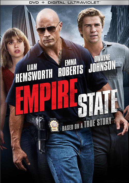
Pretty much the reason for this column to exist is lazy artwork like this. Nothing says “generic thriller” like a poorly Photoshopped cover of people walking intently. Emma Roberts looks especially shocked to be included here as an afterthought.
GOOD RELEASE ART – SEPT. 3, 2013
It is exceptionally rare that we will have more positives than negatives to say about a week’s releases. But I have no problem acknowledging when people start doing things right.
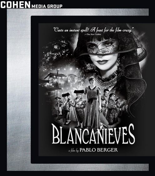
We’ll start with the arty Snow White riff, BLANCANIEVES. A collage that works and doesn’t betray the emotional pull of the film. Note that Cohen is trying to make a brand for themselves by featuring their mark on all their releases. A nice touch most people don’t bother with anymore. When dealing with indie or foreign films, brand recognition matters.
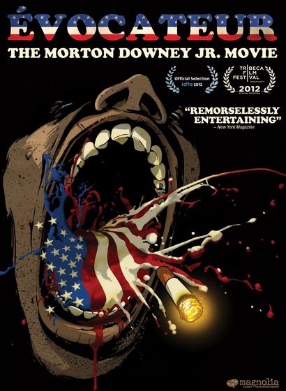
Next is the documentary, EVOCATEUR: THE MORTON DOWNEY JR. MOVIE. It’s basically the poster art, but why not stick with a winner? The thrust of the film is perfectly captured here.
TERRIBLE RELEASE ART – SEPT. 10, 2013
I passed this by several times before realizing what it was. Then, “Wait, Sony Pictures Classics?” “Wait, Pierce Brosnan?!?” If Sony’s plan was to look like every Hallmark or Dove-endorsed romantic drama and be dismissed just as quickly, mission accomplished.

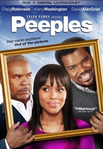
Oh, I get it. The two men are vying for a spot next to the daughter in the family portrait. Unfortunately, you don’t get any sense of depth or that any of these people are occupying the same space. Looks like more Photoshop laziness to me.
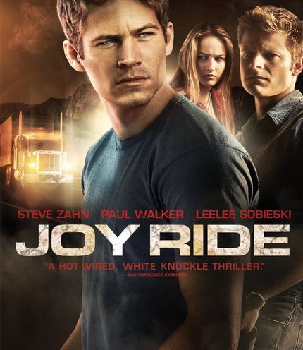
Despite garnering a sequel, John Dahl’s JOY RIDE is still an often forgotten film. Too bad, because Dahl delivers a thrilling and suspenseful ride for the entire film. And yet, lazy artwork strikes again. By far, this is the worst release art on display here. How is it possible that such a clumsy cover can be created and O.K.’ed. That crap work like this isn’t a fireable offense just goes to show how little the major studios care about artwork anymore.
Also, I have no problems with the front cover of Paramount’s STAR TREK: INTO DARKNESS discs. However, the back cover gives away the surprise twist of the film – twice! The sole reason for me not posting it here is I don’t want to spoil it for anyone who is unaware.
And no, the notion that internet chatter has already spread the twist is meaningless. Films like THE SIXTH SENSE and SOYLENT GREEN contains the most spoiled twists in film history and yet as bad as their release art is, they seem to avoid spilling the beans.
GOOD RELEASE ART – SEPT. 10, 2013
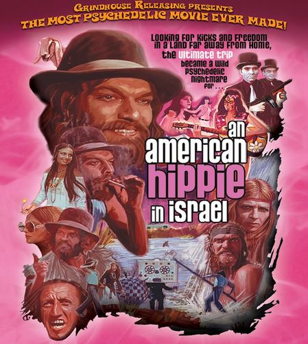
By far, the best release art in this column. This is the art for Grindhouse’s long-awaited release of the lost cult film, AN AMERICAN HIPPIE IN ISRAEL. It is not an easy film to market. And that’s why it’s so amazing that they hit this one out of the park. No, I don’t know what to expect and that’s the idea. Who wouldn’t be curious about this film after seeing this beautiful cover?
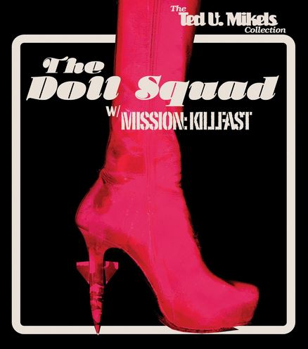
Honorable mention goes to Vinegar Syndrome for their downright Criterion-esque cover for the Ted V. Mikels double THE DOLL SQUAD and MISSION: KILLFAST.
TERRIBLE RELEASE ART – SEPT. 13, 2013
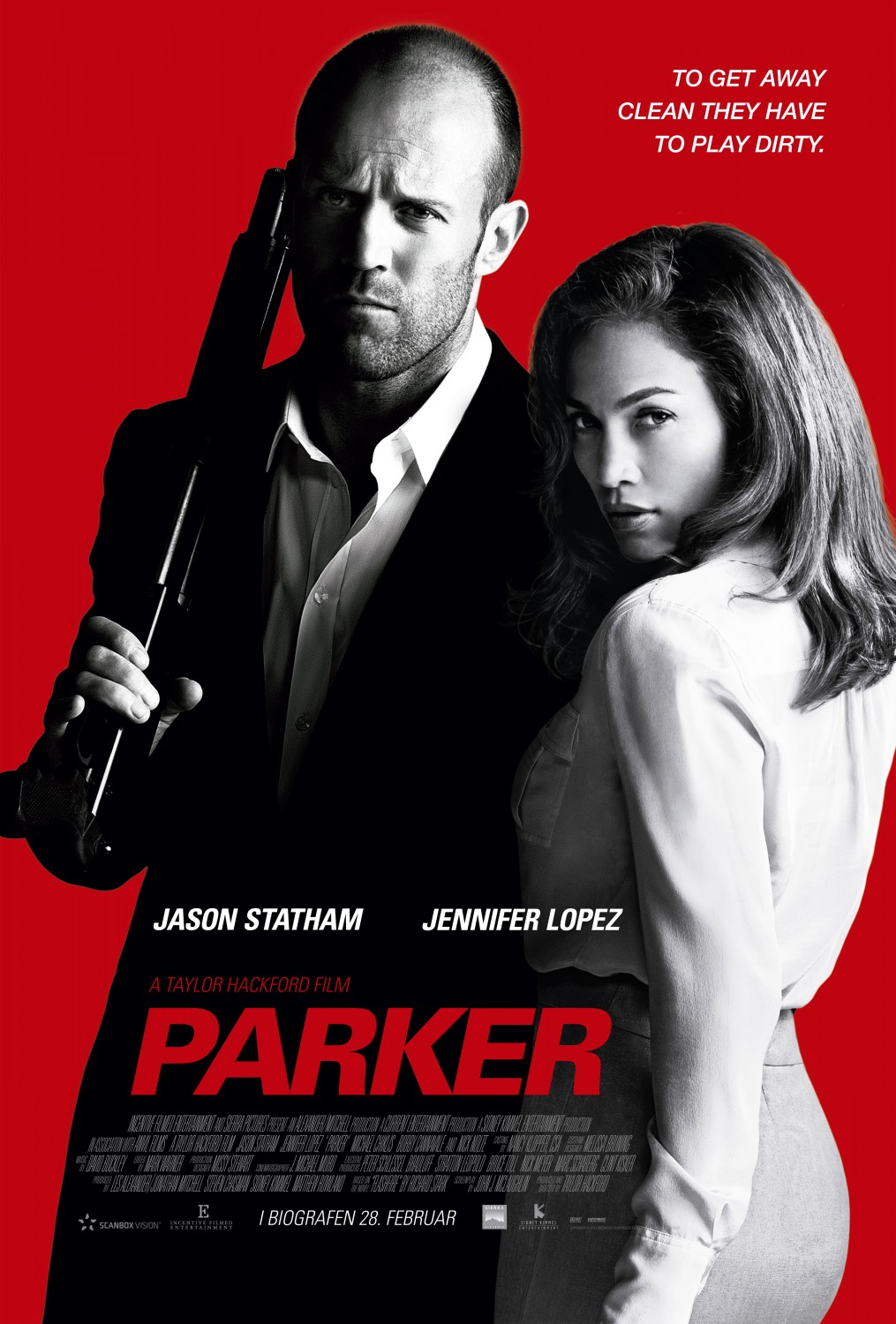
That’s right, we spotlight theatrical releases too. Not sure what they were hoping for with this poster for THE FAMILY. Unless it was, “Gee, this poster looks a lot like that disappointing Jason Statham film PARKER,” they failed. Not a good sign for an all-star cast and the behind the scenes power of Luc Besson and Martin Scorsese. You have to squint to see their names.