

Week 2 of the best and worst in film advertising art brings us some high-profile debacles, a few gems and the oddity that is generic art featuring Dominic Purcell.
There used to be some sense of pride and accomplishment when it came to marketing your film. The poster or cover art used to be a key element that drew people in. In this age of digital downloads and mass media, that is no longer the case. And unfortunately, that has led to some pretty shameful pieces of terrible posters or DVD art. This series will spotlight the best and worst of the lot.
TERRIBLE BLU-RAY/DVD ART – SEPT. 10, 2013
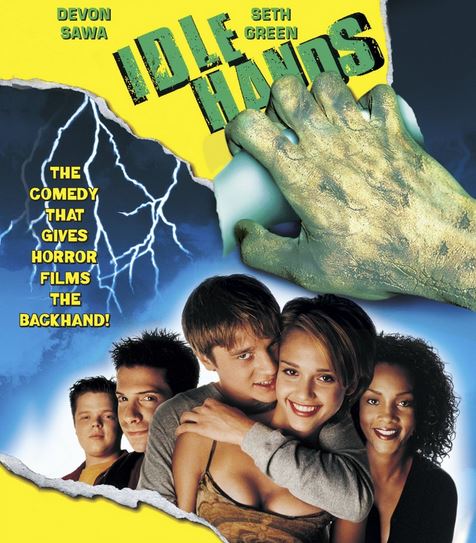
This should have been in last week’s column and would have been if I had noticed it beforehand. The horror comedy IDLE HANDS is actually pretty fun. But here we have lazy cover art that actually hurts the chances of this bringing in new viewers. Sony seems to have just repeated the DVD art from way back in 1999. And while that art isn’t bad per se, it needed updating. The fault is in the billing. If that uncredited actress looks familiar she should. That’s Jessica Alba, pre-DARK ANGEL, pre-SIN CITY. Alba was just 18 years old when she made this film. Not only did she give a fine performance, but some of the sexiness in her role certainly jettisoned a few young people through puberty at the time. And yet, now that you can see barely legal Alba in all her HD glory, they don’t even bother to add her name to the cover art? Wow, that’s pathetic. Meanwhile, does anyone care about Devon Sawa?
TERRIBLE BLU-RAY/DVD ART – SEPT. 17, 2013
Hey, this film stars the great songstress Sarah Brightman! And Richard E. Grant! But most people wouldn’t know that. Potential viewers are brought in by images and only after those images draw you in do you stop to read credits, taglines, critical raves, etc. No one pays attention if the art of symmetry of the piece doesn’t draw them in.
And here we have one of the most abundant trends in lazy art – the split image. You’ll be seeing this a lot here this week and in the weeks to come. It’s as if they just plug random images into a template. I’m sure they take more than twenty minutes to put together, but it sure doesn’t look like it.

SNORE.
SNOOOORE
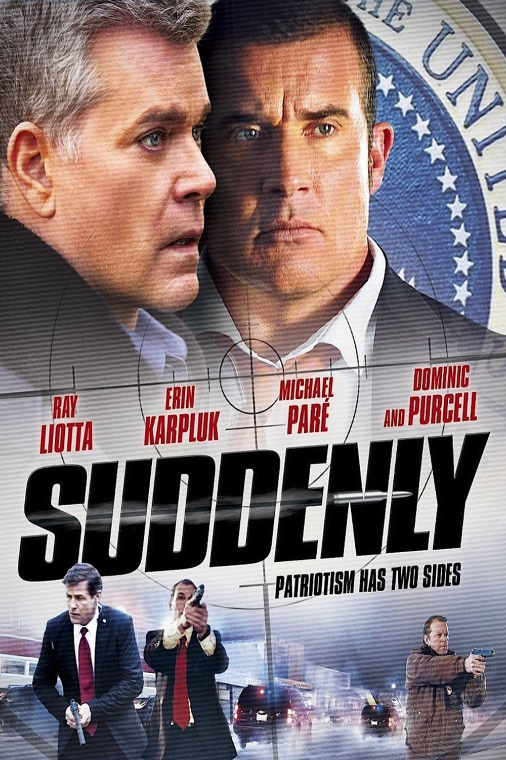
SNOOOOOORE- Wait, Dominc Purcell again?!?
The artwork for ABERRATION isn’t bad. In fact, I think the arm draped into the foreground is a nice touch. However, we’re seeing a lot of indie horror films with creepy kids on the cover. And it’s getting harder and harder to differentiate each release. To illustrate, I’m showing the artwork for ABERRATION followed by the artwork for UNBROKEN, which was just released last month. Behold the similarities. It isn’t just these two films either. We’re seeing a lot of this. Any originality that may be contained within the films is not showcased with this “follow the leader” technique.


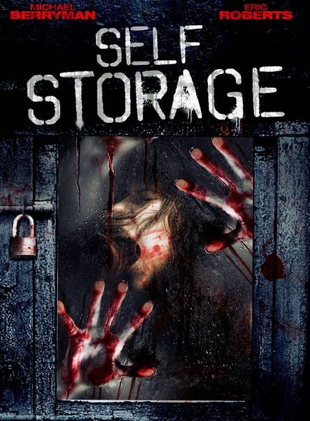
Speaking of horror films, it took a while for Hollywood to get sick of the torture porn flicks. And only now are they moving away from a larger canvas I dubbed “the cinema of cruelty” early on – films that are basically about women being tortured and killed and with a distinct sense of ho-hum, generic, cheap nihilism emanating throughout. The artwork quickly became as uninspired as many of the lesser films in this subgenre. Throw in some scratches and a bloodied, beaten woman in a bad spot. Sometimes, like in SELF STORAGE, the effect is not creepy, but unintentionally funny. It looks like she just ran into a sliding glass door and is slowly peeling off of it.
There are a lot of things that fascinate me about SHOWGIRLS 2. For one thing, I’m still surprised they made one. For another, there’s the subtitle, which we will get to in a moment. Then there’s the fact that it is nearly two and a half hours in length. But most of all, I am interested in the fact that the star, Rena Riffel had a very small part in the original SHOWGIRLS. and parlayed that into not only starring in the sequel, but also writing, producing and directing it as well. I know very little about Riffel, despite still recalling her guest starring turn as Pussy Magnifico on the old Julie Brown show STRIP MALL. She seems to pride herself on strange and arty films as well as the type of campy, trashy stuff I’m attracted to. Hence, I will probably see this film despite it being a sequel to one of the worst films of the 1990s.
But now onto the DVD, which comes two years after the film was completed and more than a year after it was released in Europe. What we have here is someone not understanding their audience. First of all, we have legs. Good, we like legs and more importantly, so do many of the people attracted to a SHOWGiRLS sequel. Fishnets are cool too. But not when they are do dark and cover so much that she looks more clothed than if she had walked out in a skirt.
Then we have the billing. I get that they want to brag about anyone from the original coming back for the sequel. But the only two people returning that should be at the top are Elizabeth Berkley, Gina Gershon or Gina Ravera. Since it doesn’t look like of them have come back, you may as well put Riffel’s name on top. She’s obviously the star and has ushered this film in like a true auteur. Many of SHOWGIRLS’ fans, even the large contingent of gay males who hold it up on an altar of cheese like MAHOGANY or VALLEY OF THE DOLLS, care about any males returning to the show. At least not as much. Hence, putting Glenn Plummer on top seems a bit wrong. A better choice would be to have the billing read “RENA RIFFEL, DEWEY WEBER and GLENN PLUMMER.” It spotlights the actor without creating an illusion that you’re pinning all of your hopes on him. Oh yeah, and Dewey Weber is also a returning actor from SHOWGIRLS. So, why is he billed last? Again, just put Riffel on top, people.
And finally, we have the subtitle “PENNY’S FROM HEAVEN.” Get it? The main character is named Penny (“Penny Slots” actually). And it’s as if Penny herself is from heaven. I like a good play on words But that’s just it, I like a good play on words.
Anyway, here’s the art, coming from Wild Eye Releasing – one of my companies no less.

GOOD BLU-RAY/DVD ART – SEPT 17, 2013
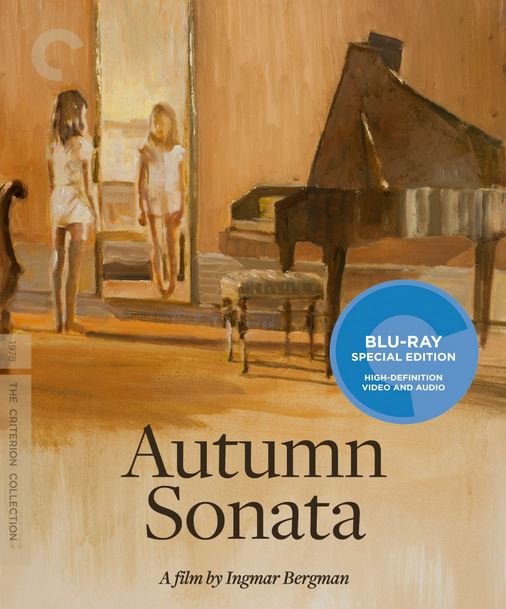
It’s no secret that the most consistently great cover art comes from Criterion. They had two releases this week, the other one being Richard Linklater’s SLACKER. And while that artwork is nothing to sniff at, their work on Ingmar Bergman’s melancholy AUTUMN SONATA really steals the show.
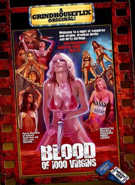
Last week, I talked about indie brands that leave their mark on each cover. Charles Band is doing that with his Grindhouse Flix series. They feature a border that is interesting enough, making the center art look like a skewed poster. Since Band’s old video label, Wizard Video was responsible for some of the most memorable cover art from the big box VHS days, this continues in that tradition.

The Shout! Factory subsidiary, Scream Factory, is doing some amazing things with their artwork. They have recognized the great artists working the field of horror art. People like Chris Kuchta and Marc Schoenbach bring a beautiful artistic flair in homages that any true connoisseur would appreciate. This artwork for DAY OF THE DEAD was designed by Nathan Thomas Milliner and it looks amazing. Without a doubt, this gets the nod for BEST ARTWORK OF THE WEEK. It’s just beautiful and you could stare at it endlessly.

BAD THEATRICAL RELEASE ART – SEPT. 20, 2013
I’m actually hearing some good things about PRISONERS. But here we have the attack of the split screen posters again. Oh well, so much for ending this week on a happy note.

